More volume.
Less noise.
Musical Vision already had the services and personality. Its website needed to communicate them more clearly.
I created a new logo and visual direction, reorganised the service journeys and built the responsive concept in Webflow. This self-initiated project explores a clearer route to recording, rehearsing and tutoring; it is not a commissioned or live client website.
- Challenge
- Refresh an established website without losing the character of the business
- My role
- Brand and web designer
- What I did
- Identity / UX structure / Visual design / Responsive Webflow build
- Status
- Concept redesign, not a live client website
The opportunity
Make it feel
like music.
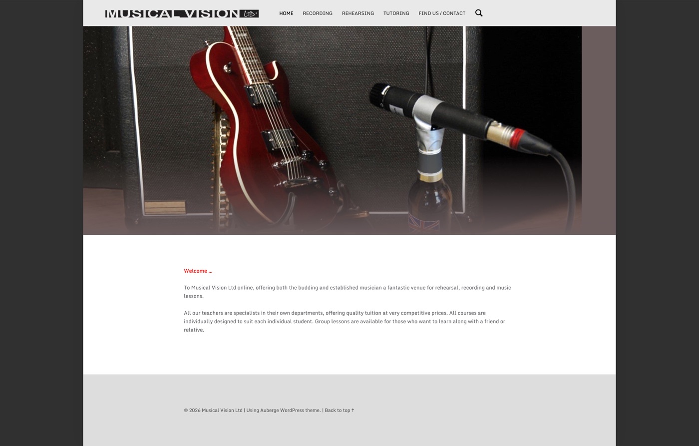
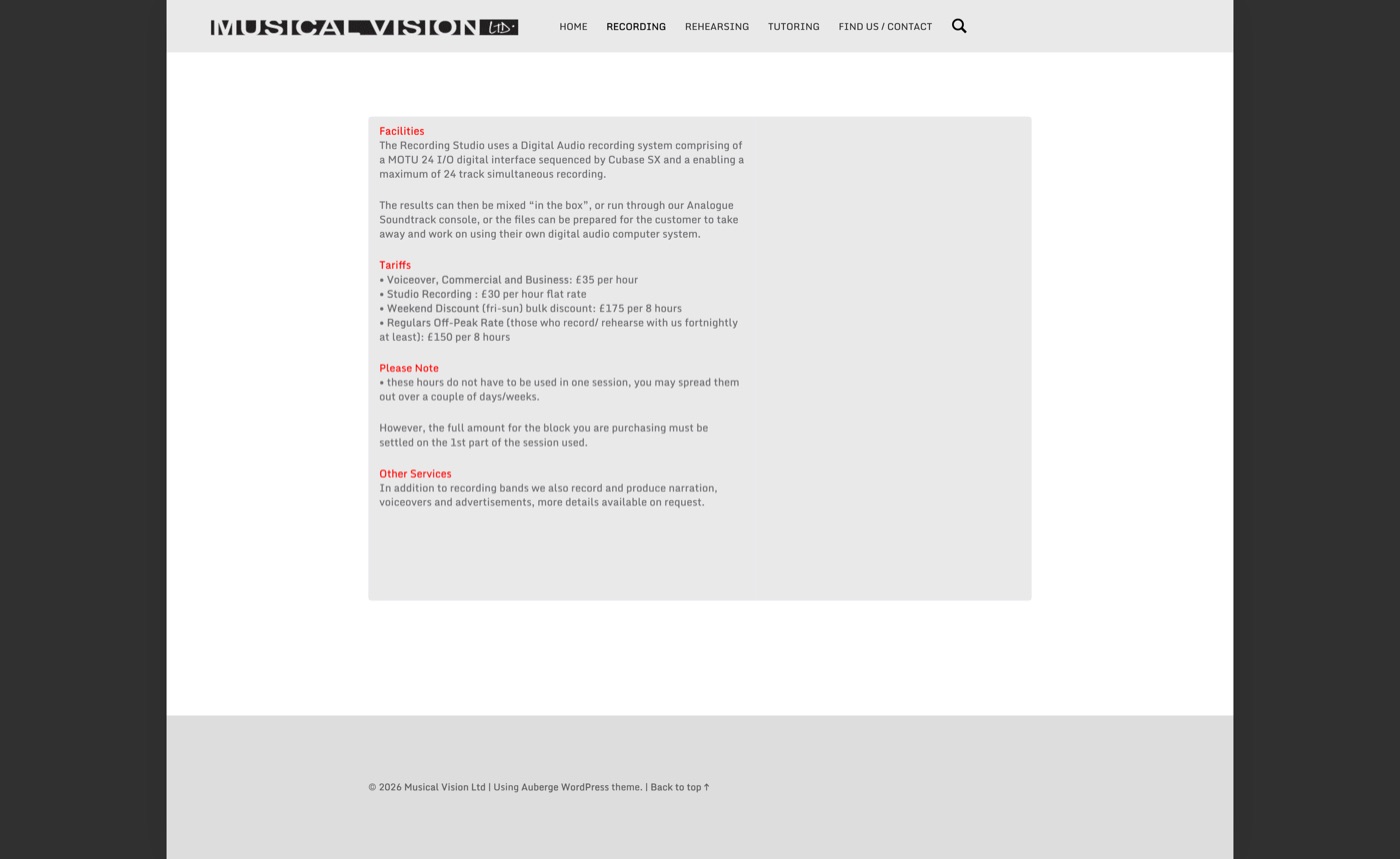
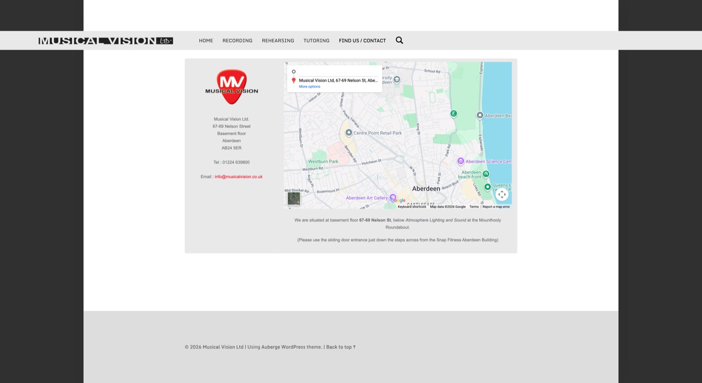
The original site contained the essential information, but the presentation felt quiet and dated for a recording, rehearsal and tuition business.
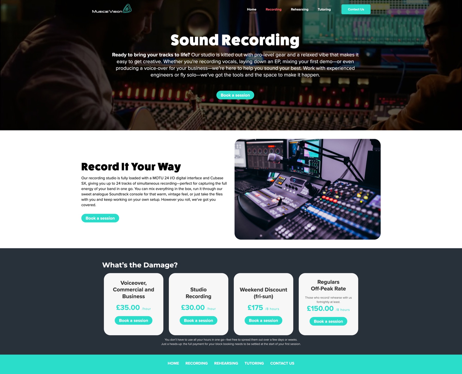
The concept shifts the emphasis from simply listing facilities to showing the experience: an atmospheric first impression, clear service choices and an obvious route to booking.
01 / The starting point
Useful information.
Not enough energy.
The existing pages provided the basic details, but large empty areas, long text blocks and limited calls to action made the services harder to scan and the business harder to feel.
02 / Identity and direction
A clearer signal.
I designed a new Musical Vision logo and used its rounded line form as a flexible graphic device. Turquoise highlights, dark photography and bold typography create a more contemporary identity without making the site feel overproduced.

MAKE MUSIC.
MAKE IT YOURS.
The language and visual system introduce the studio with more confidence while keeping the practical routes to its services close at hand.
03 / Clearer service journeys
Choose a service.
Know what comes next.
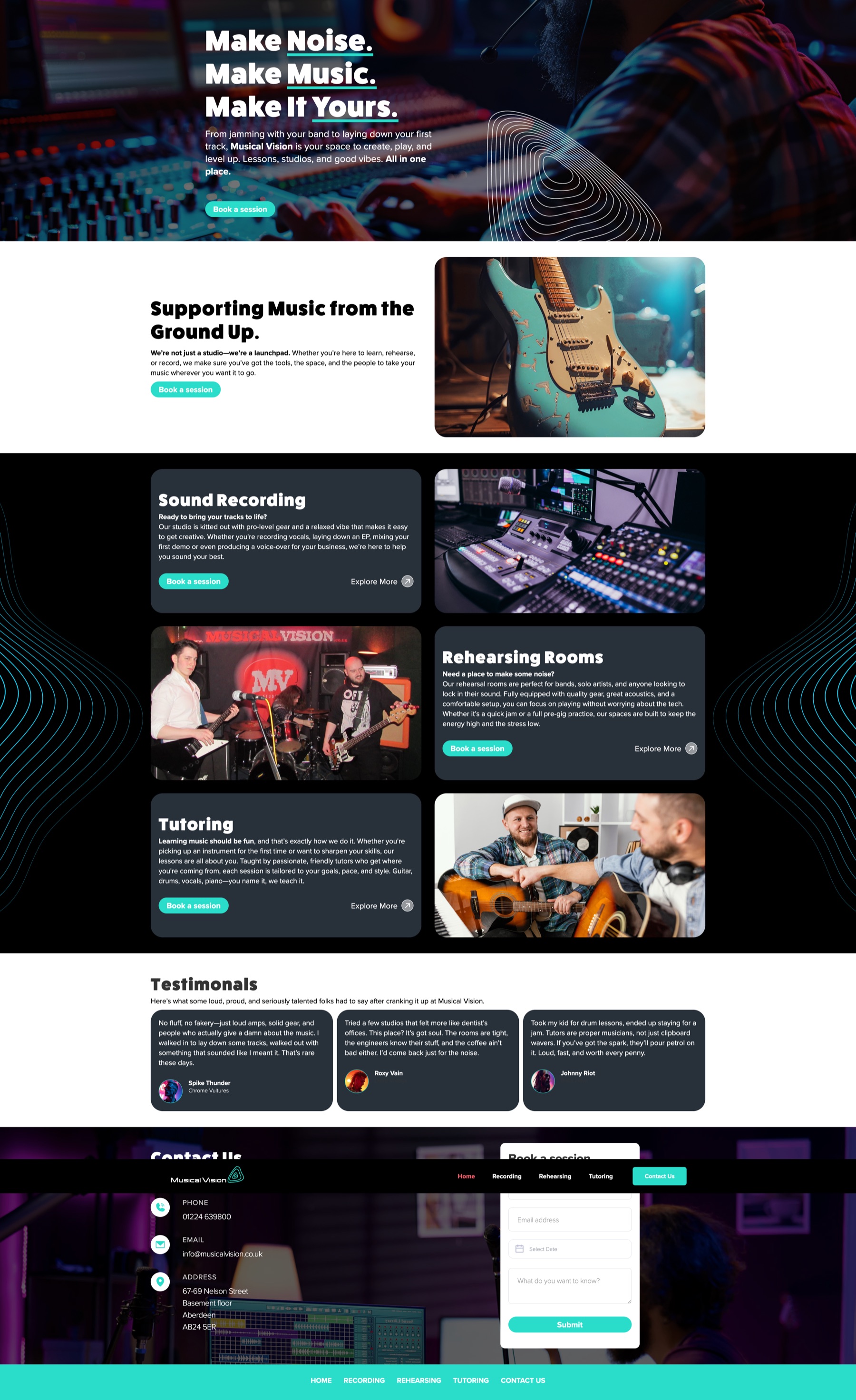
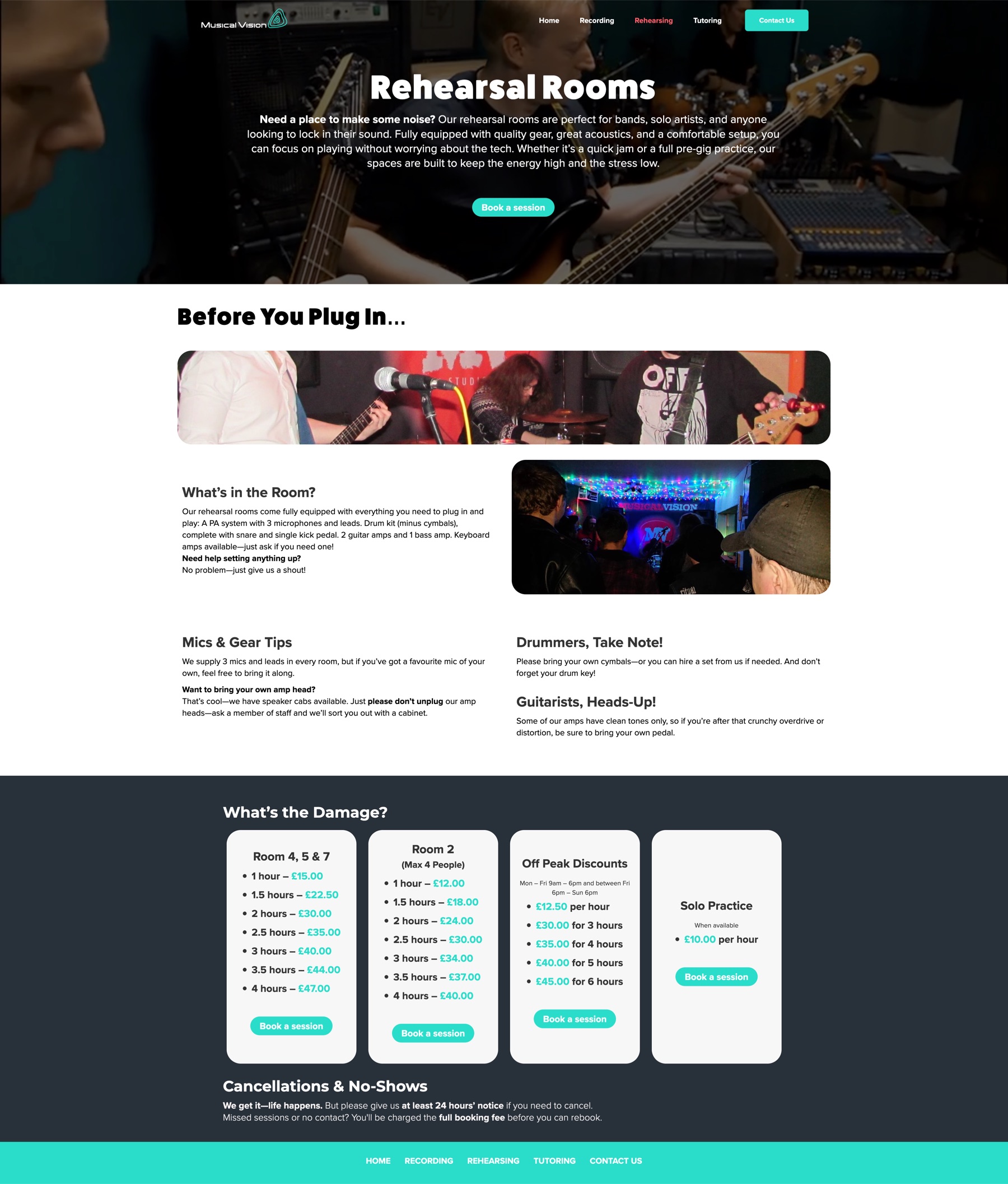
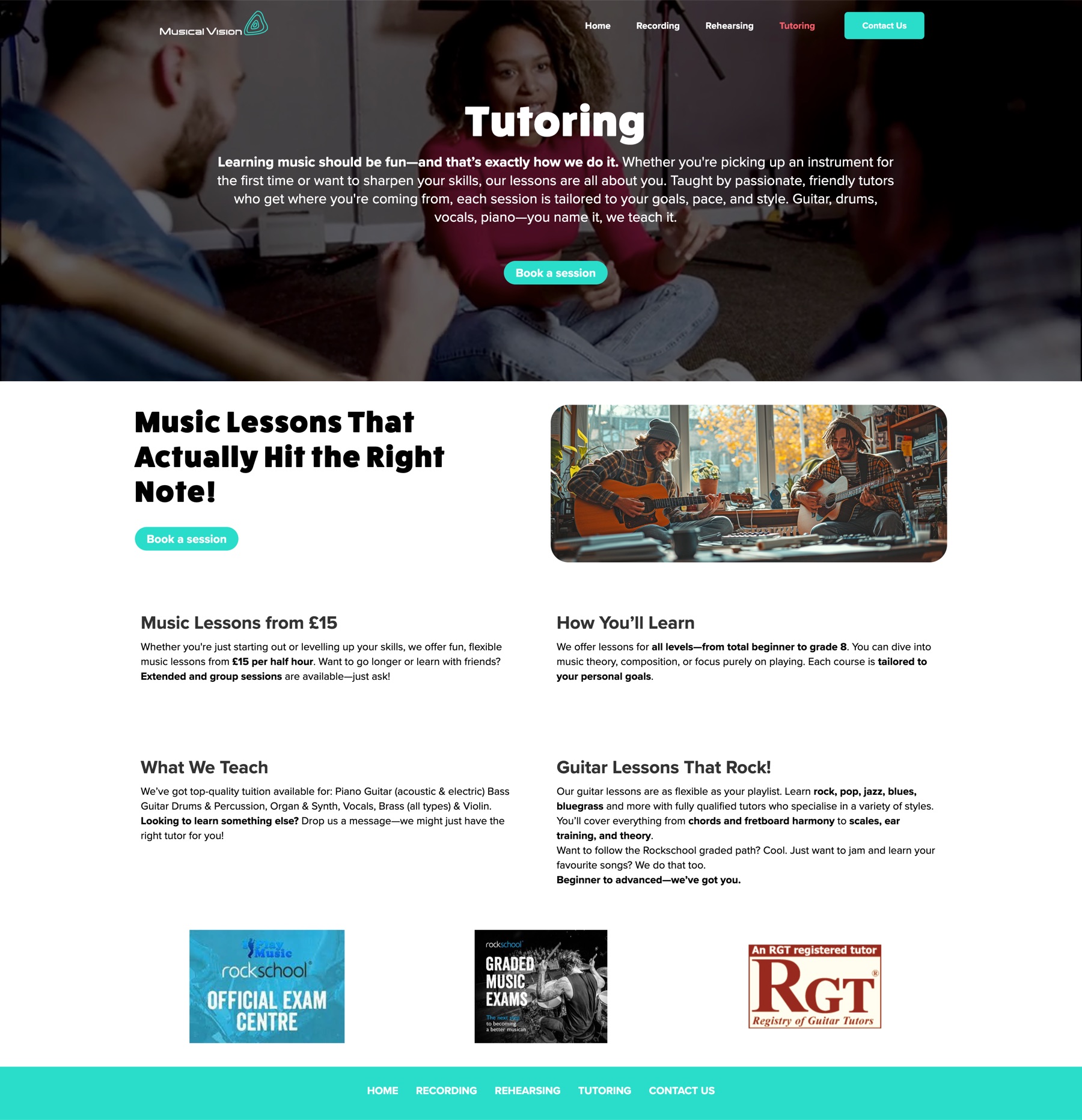
The homepage turns Recording, Rehearsing and Tutoring into clear destinations. Each service gets its own explanation, supporting imagery and repeated booking prompts.
Lead with atmosphere
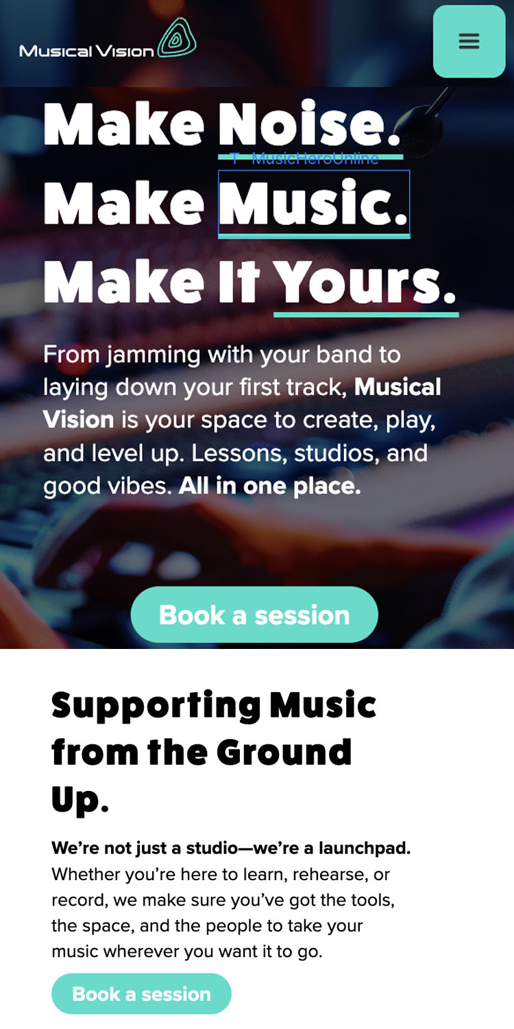
The opening screen establishes the character of the business before introducing the individual services.
Keep booking visible
Calls to action repeat at useful decision points instead of relying on a single contact link in the navigation.
04 / Responsive experience
Same energy.
Different screens.
The Webflow build adapts the layout for desktop and mobile, keeping the hierarchy, navigation and booking prompts clear when the available space changes.
05 / My contribution
Identity.
Structure.
Build.
I redesigned the Musical Vision identity and website, including the new logo, visual direction, page structure and user journeys. I built the responsive concept in Webflow and selected photography through Magnific.
I used ChatGPT to help develop the initial website copy, then shaped and applied it across the design. This is a self-initiated concept redesign, not a commissioned or live client website.
Design outcome
More inviting.
Easier to use.
The concept transforms a quiet, information-led website into a more energetic and action-focused experience. A stronger identity, clearer service journeys and repeated booking prompts make the business easier to understand and give the website more of the character of a working music studio.
As a concept redesign, this demonstrates the intended improvement rather than claiming measured business results.