Same brand.
Room to think.
A practical design system for keeping Langstane’s work consistent, without making every job look exactly the same.
I’m developing the templates, typography styles and reusable components that apply Langstane’s refreshed brand across print and digital. This is a practical toolkit for my own workflow, and it continues to develop.
- Challenge
- Apply a refreshed brand consistently across print and digital
- My role
- Design system development / Template creation
- What I did
- Typography / Adobe Libraries / Online styles / Components
- Outcome
- Reusable toolkit in use in my own workflow / Still developing
The approach
Consistency.
Not copy
and paste.
The refresh made two straightforward changes: we removed “all your office needs” from the logo and replaced Helvetica with Poppins as the corporate font.
Those changes needed to carry through into everyday work, not just the logo file. I began building new templates, style sheets and components for print and digital.
I use shared typography and components to give each piece a consistent starting point. The layout can then respond to the content, rather than forcing every message into the same template.
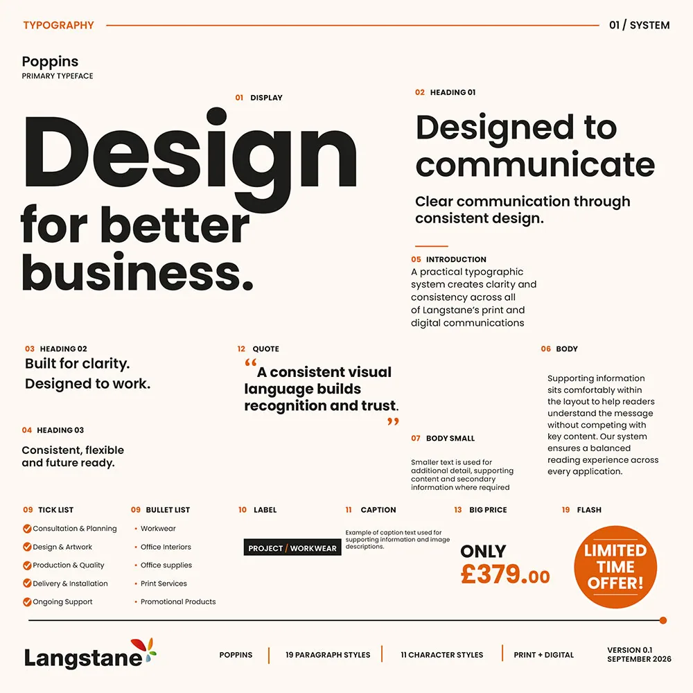
01 / Typography
Give every word
a job.
We chose Poppins for its clean lines, modern appearance and legibility on screen. Its range of weights gives me flexibility within one family. I’ve also set up online templates to standardise H1, H2 and H3 headings and colours.
02 / Components
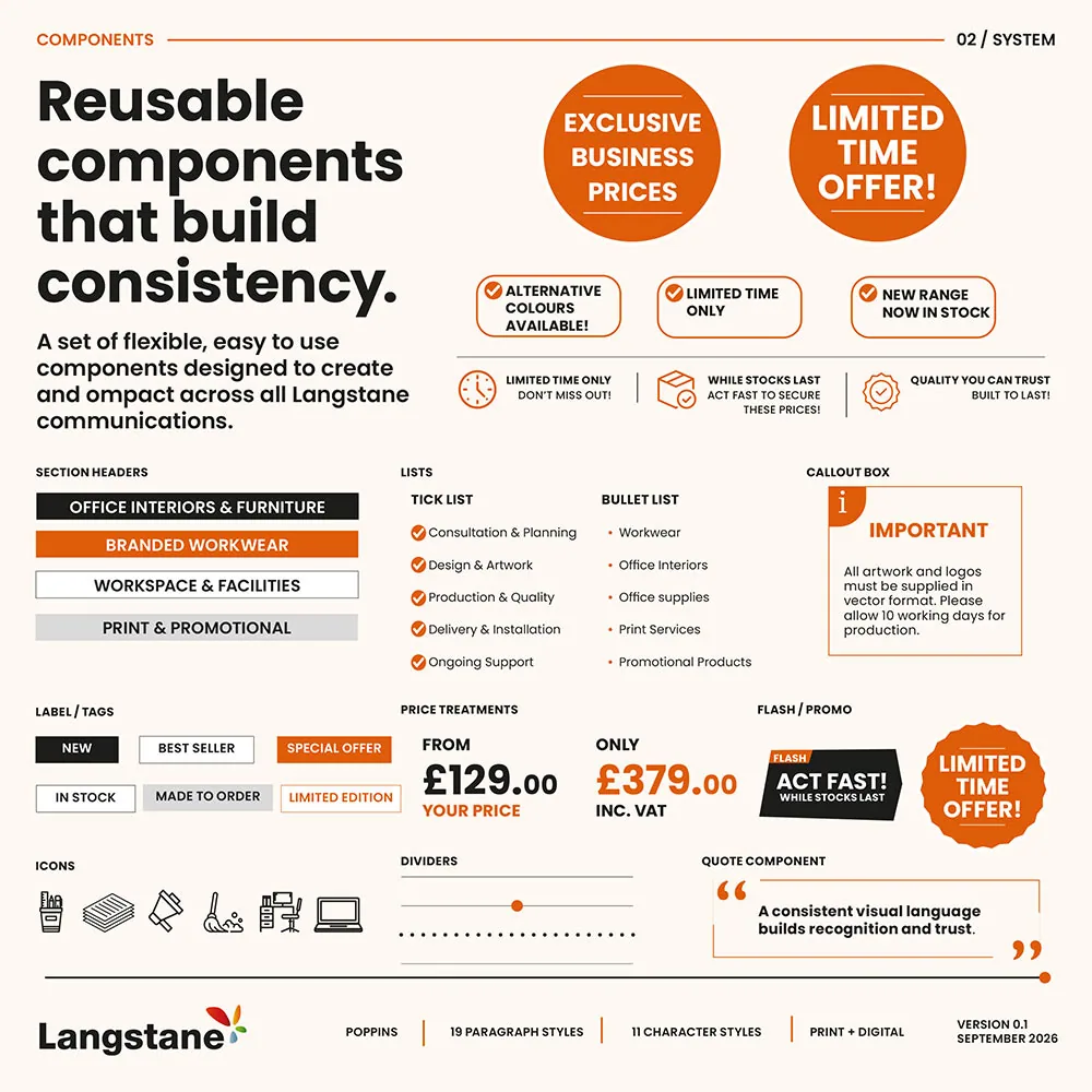
Build once.
Make it work harder.
I’ve created new components for print and digital, with the print components and typography styles stored in Adobe Libraries. That keeps them accessible across the Adobe apps I use, rather than having to find and copy them from an older job.
03 / In use
Different jobs.
Same family.
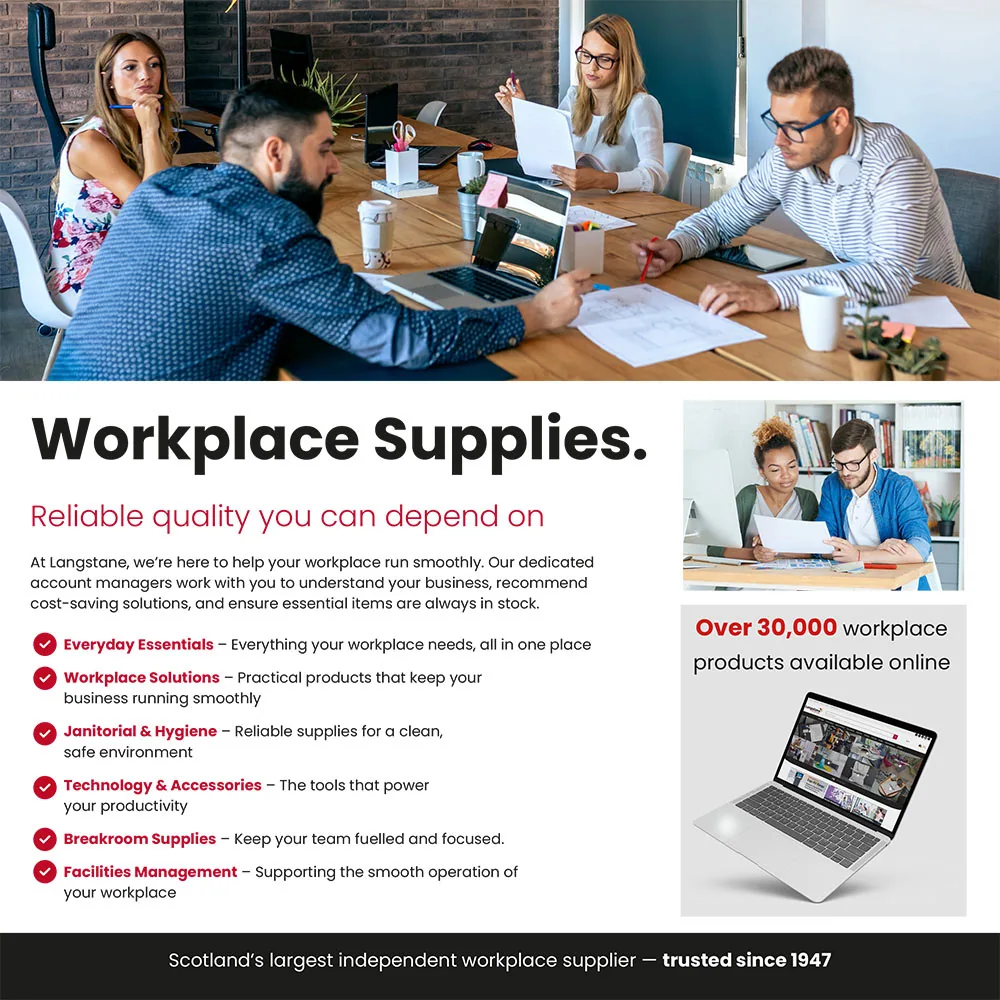
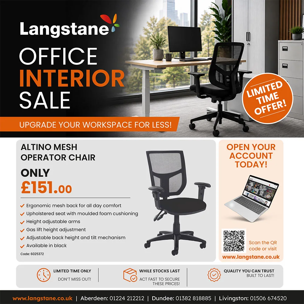
The workplace supplies and office interiors examples show how the updated typography and components come together. The content changes, but the shared styles keep both pieces recognisably Langstane.
Outcome
A better
starting point.
The developing system provides a shared visual foundation for Langstane’s print and digital communications. Reusable components, templates and typographic rules reduce repeated design decisions while leaving enough flexibility for different messages and audiences.
A work in progress
A system that
earns its keep.
I’m currently the only person using the system. It’s a practical part of my own workflow, bringing the refreshed brand into the templates and components I use across print and digital.
The system is still developing. The focus is on keeping those reusable elements organised and consistent, so each new job can start with the updated styles rather than an old layout.
Let’s talk about your project ↗