Different formats.
One connected campaign.
Hundreds of promotions over the years. Some start with supplier artwork. Others start with a group of products and a reason to bring them together.
I develop original campaign layouts and copy, and adapt supplier creative for Langstane’s channels: banners, landing pages, email, flyers and brochures. The examples below distinguish my design contribution from supplied brand assets.
- Challenge
- Keep each promotion connected across very different formats
- My role
- Campaign design / Copy / Supplier artwork adaptation
- What I did
- Concepts / Design / Supplier adaptation / Campaign copy
- Outcome
- Hundreds of campaigns across print, web and email
The approach
Not just
a different size.
A wide banner, a long email and a brochure have different amounts of space and different jobs to do. The message needs to stay recognisable while the layout changes around it.
I’ve worked on promotions involving suppliers including Fellowes, Scotch, Standivarius, Durable, Scrubb, Post-it, Avery and ACCO, alongside original Langstane themes such as cleaning essentials, workplace supplies and promotional products.
01 / Original themed promotion
Event Essentials.
One useful offer.
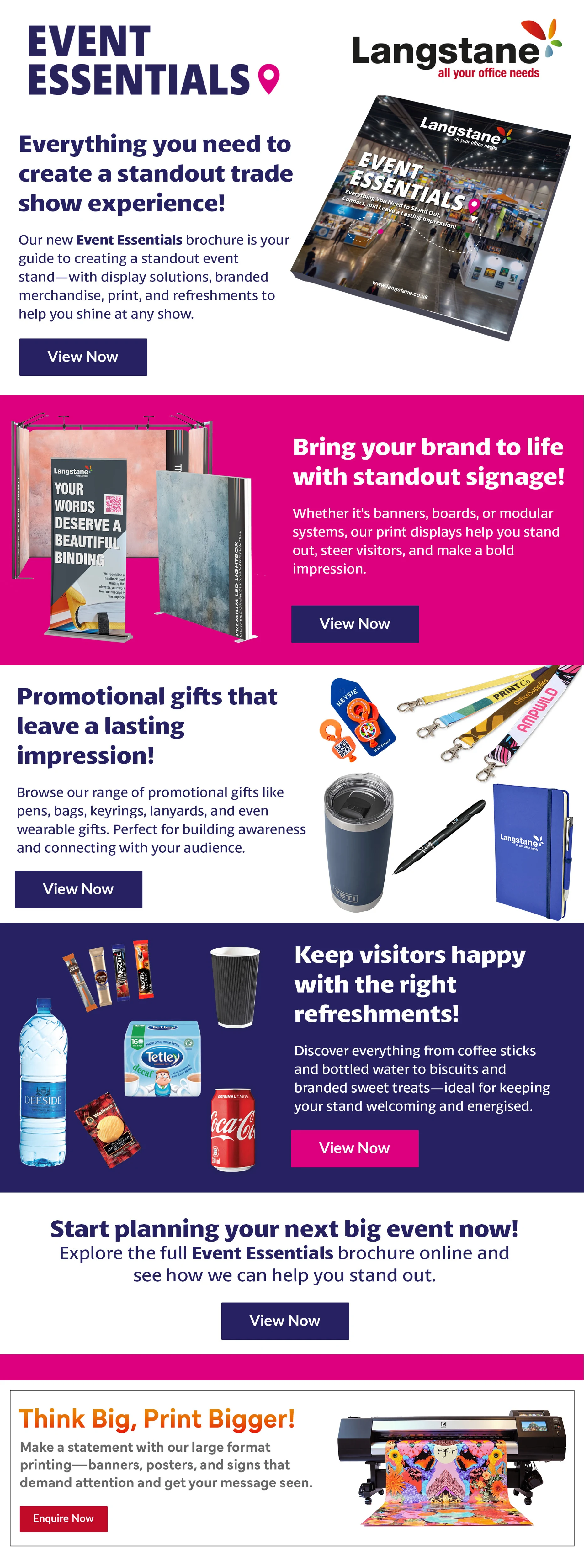
Signage, branded merchandise, print and refreshments: different products brought together around the needs of a business preparing for an event.
The Promotional Products team and printers selected the range. I sourced the images, gathered product descriptions, wrote the other campaign copy and designed the brochure, email and banners.

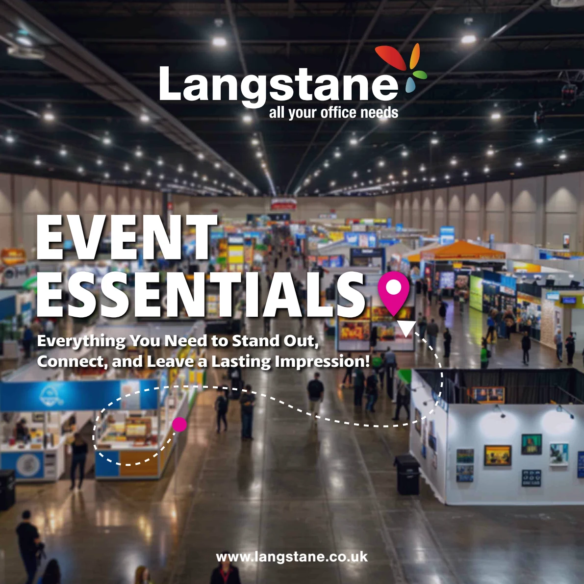
A theme to hold
the range together.
The navy, magenta and location-pin motif connect the materials. The brochure gives room to explain the range, while the banners introduce the theme and the email breaks it into practical product groups.
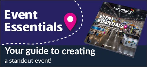
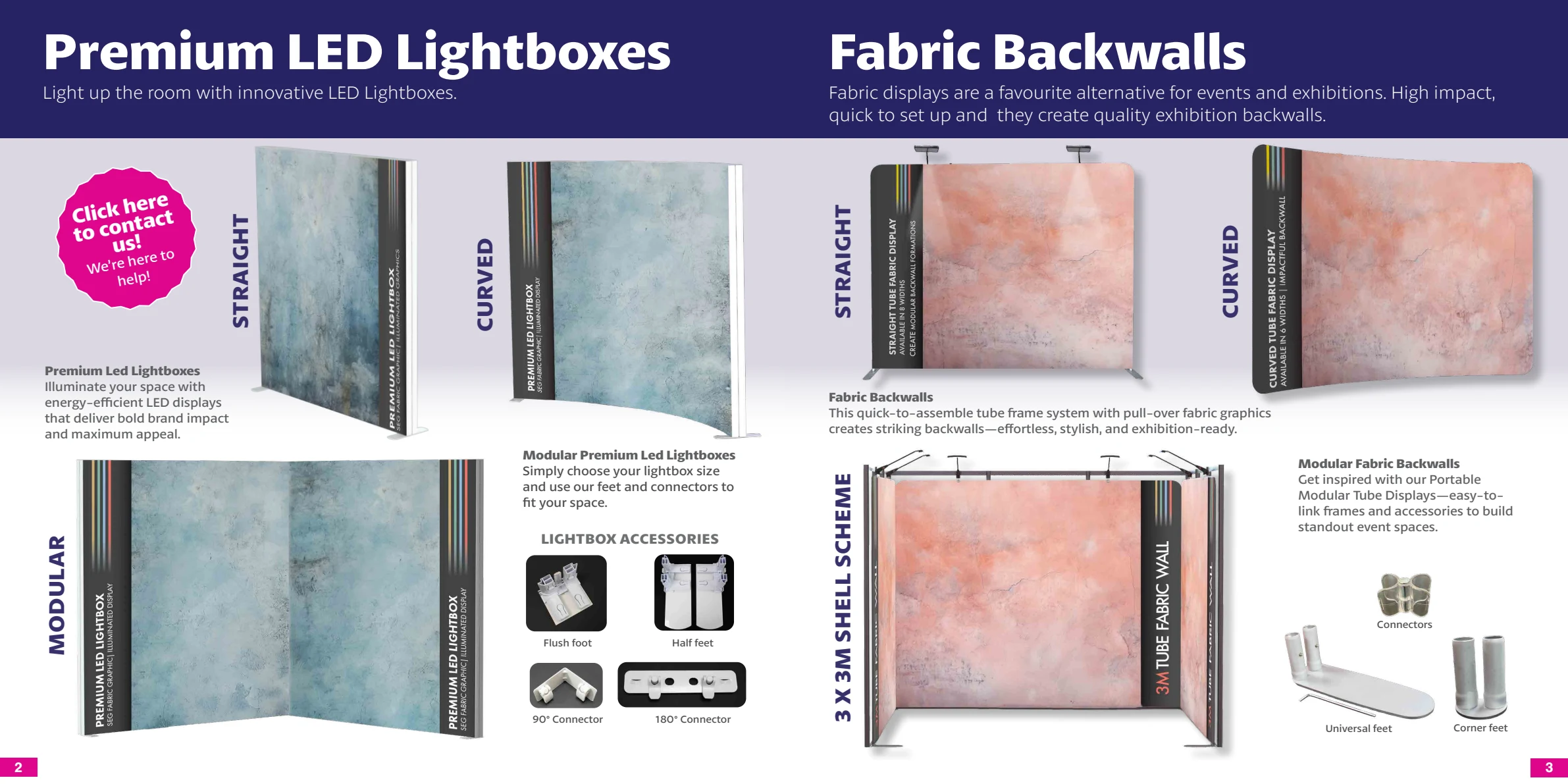
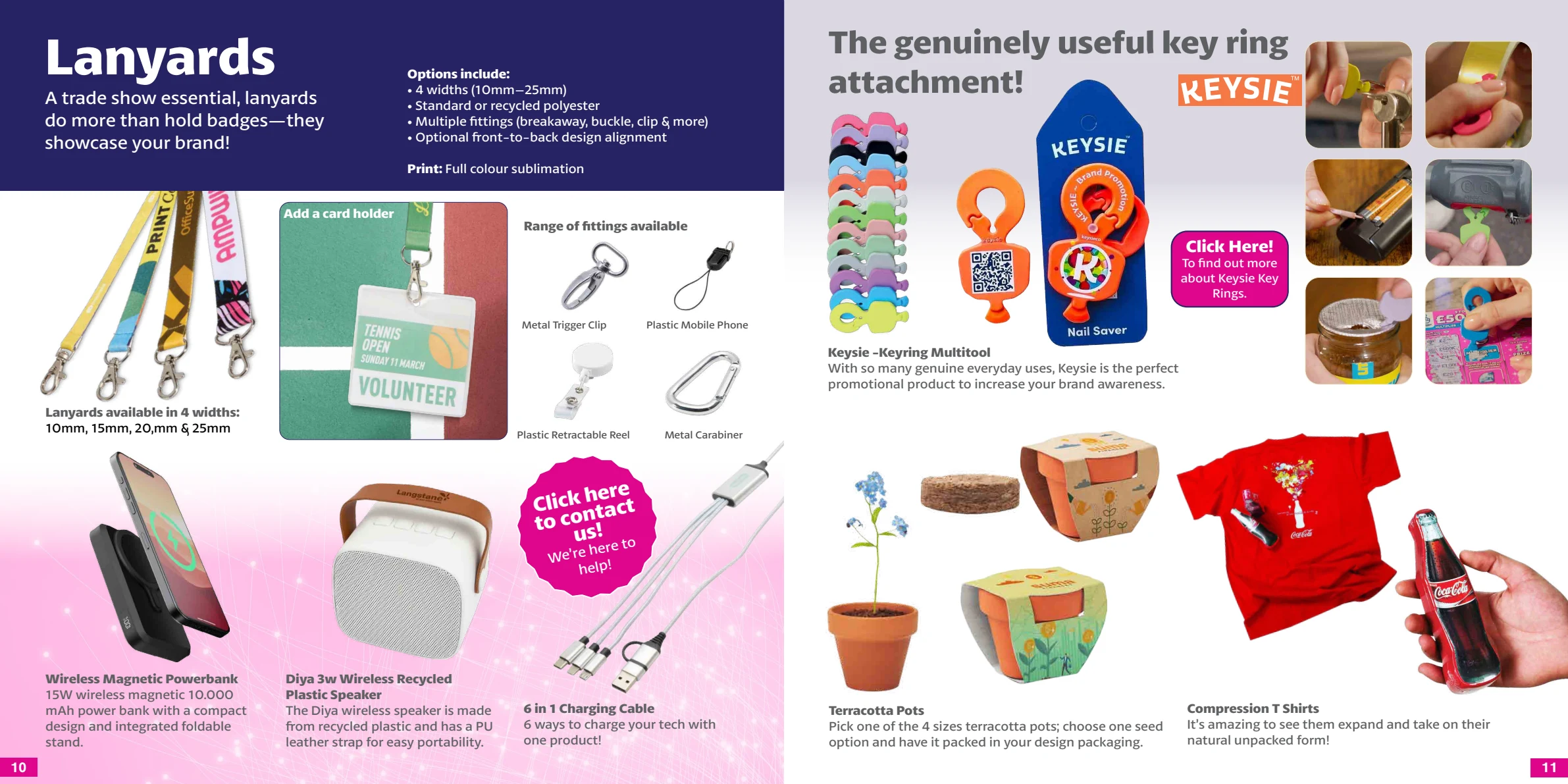
Space to explain.
Selected brochure spreads show display equipment and promotional gifts within the same campaign language.
A reason to click.
Then another.
The email introduces the brochure, then gives signage, promotional gifts and refreshments their own section and call to action. It carries the same visual identity without copying the brochure page for page.
The full email is shown alongside. Open the artwork to read it at a larger size.
02 / Supplier campaign adaptation
Post-it.
Keep the character.
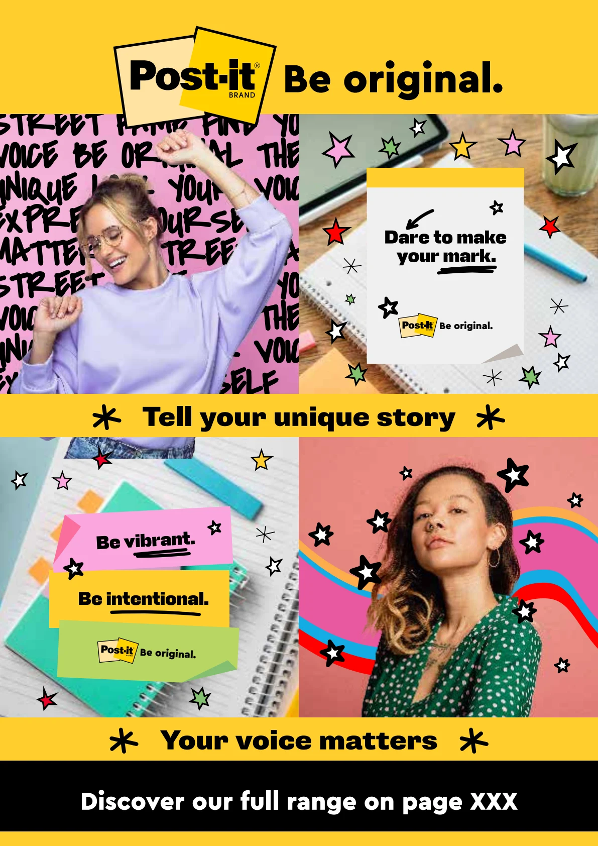
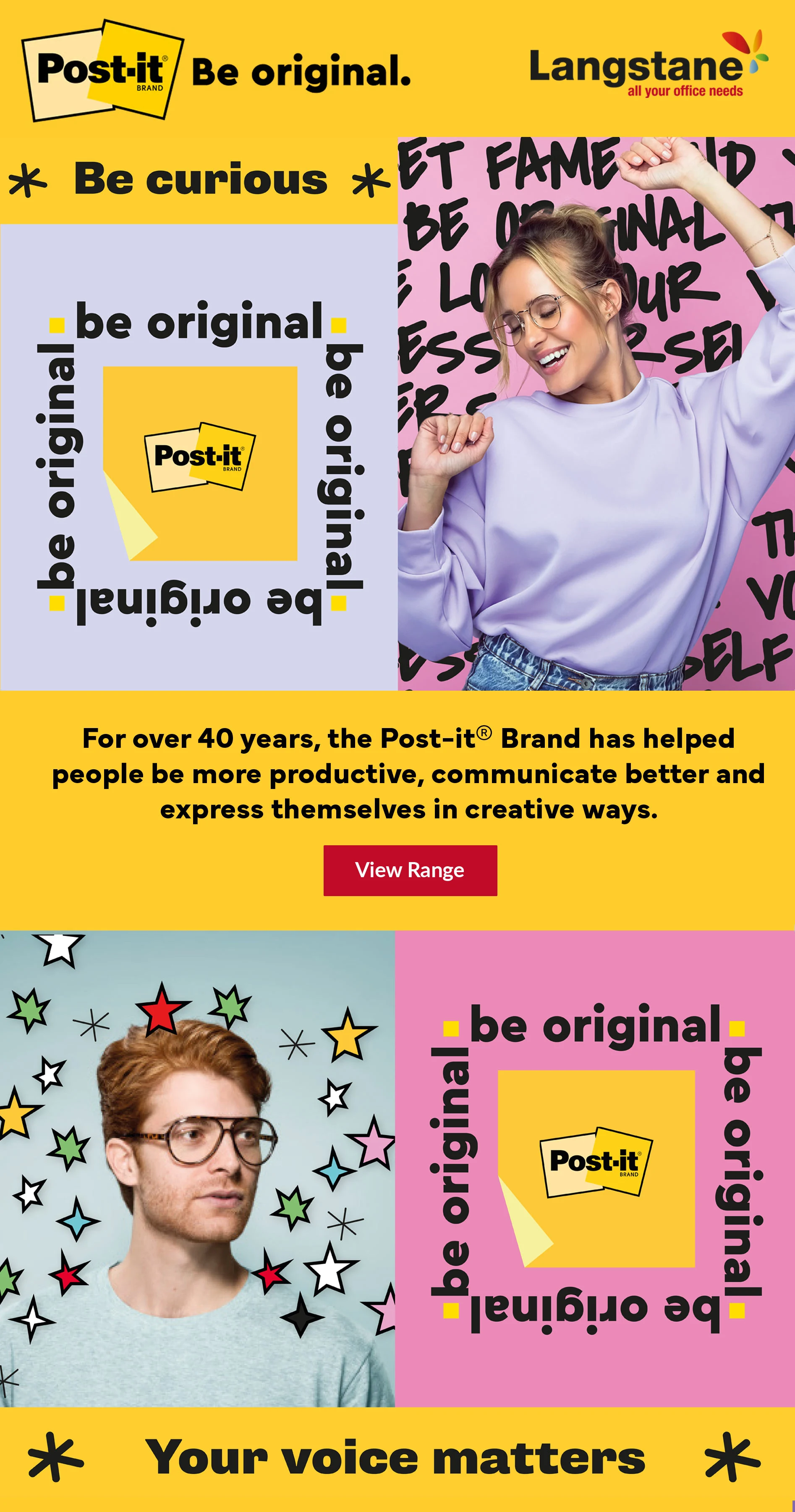
The starting point was supplied Post-it campaign artwork. I adapted it to Langstane’s banner formats and email, keeping the supplier’s recognisable colour, imagery and tone.
Layout adaptation and Langstane channel artwork. The original Post-it creative, branding and campaign assets were supplier-supplied.
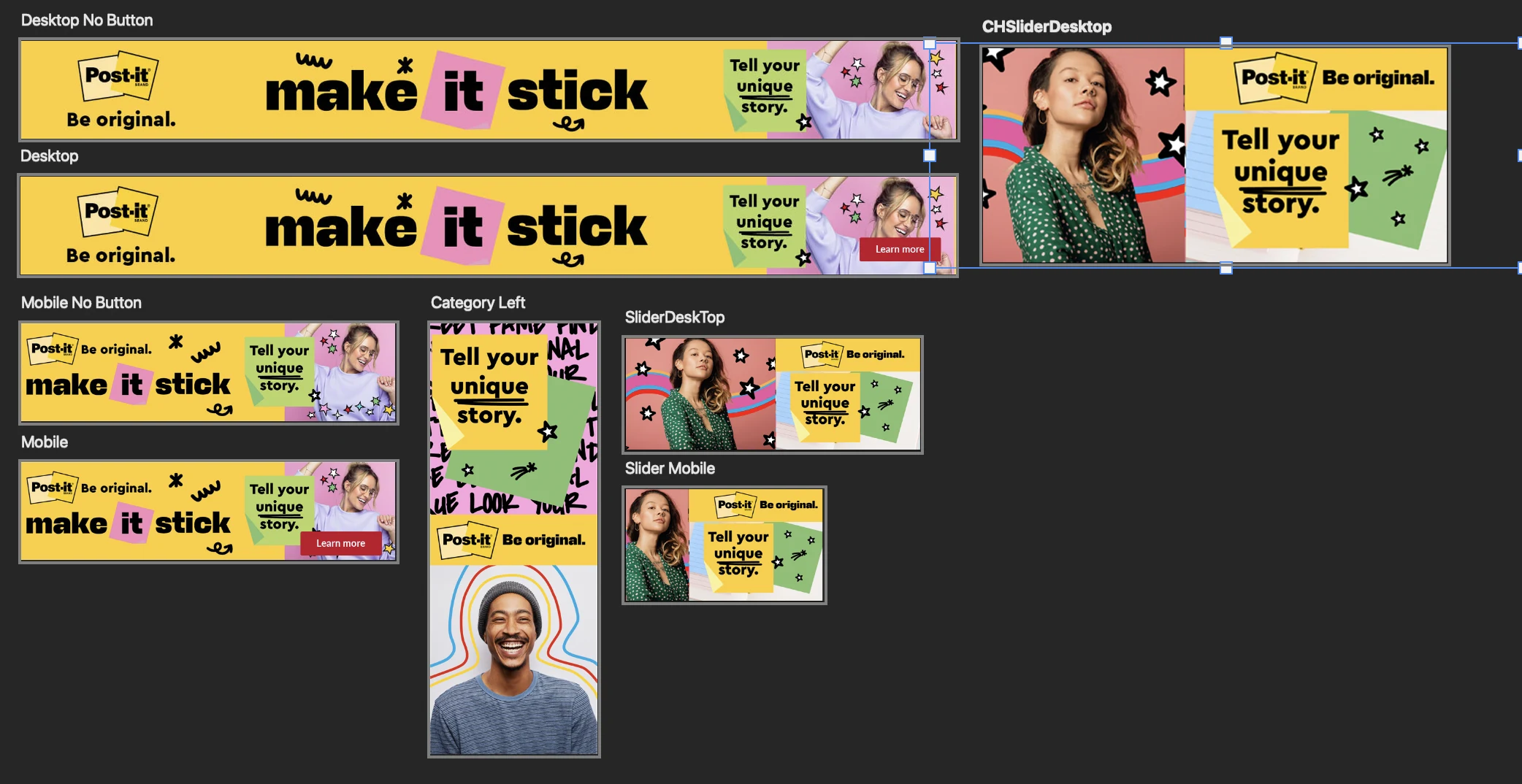
Rearrange. Don’t just shrink.
Desktop, mobile, sidebar and slider placements need different compositions. This working sheet shows the range of formats and versions with and without buttons.
03 / Connected digital formats
Nescafé.
From banner
to landing page.
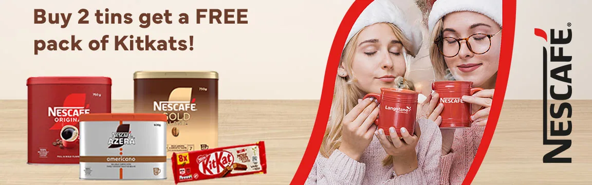
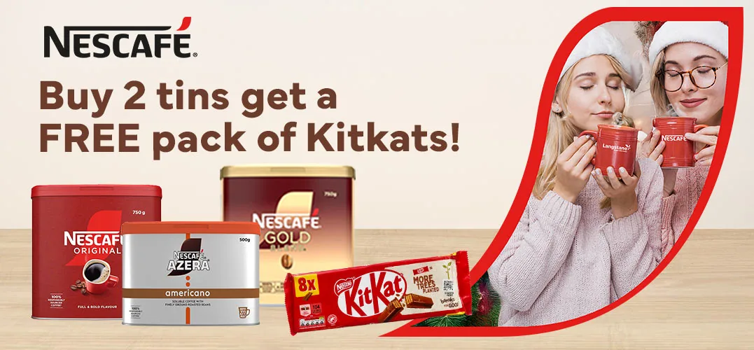
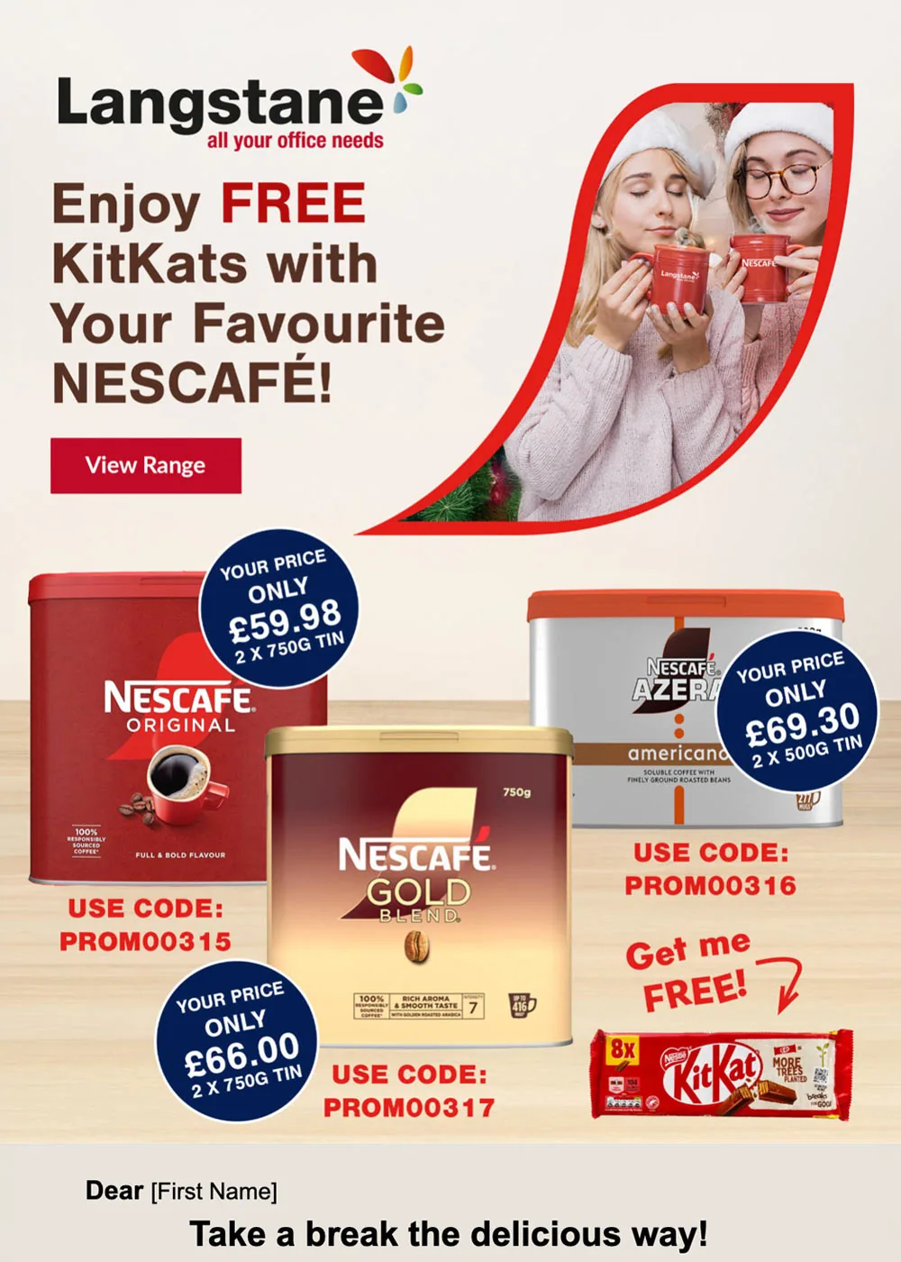
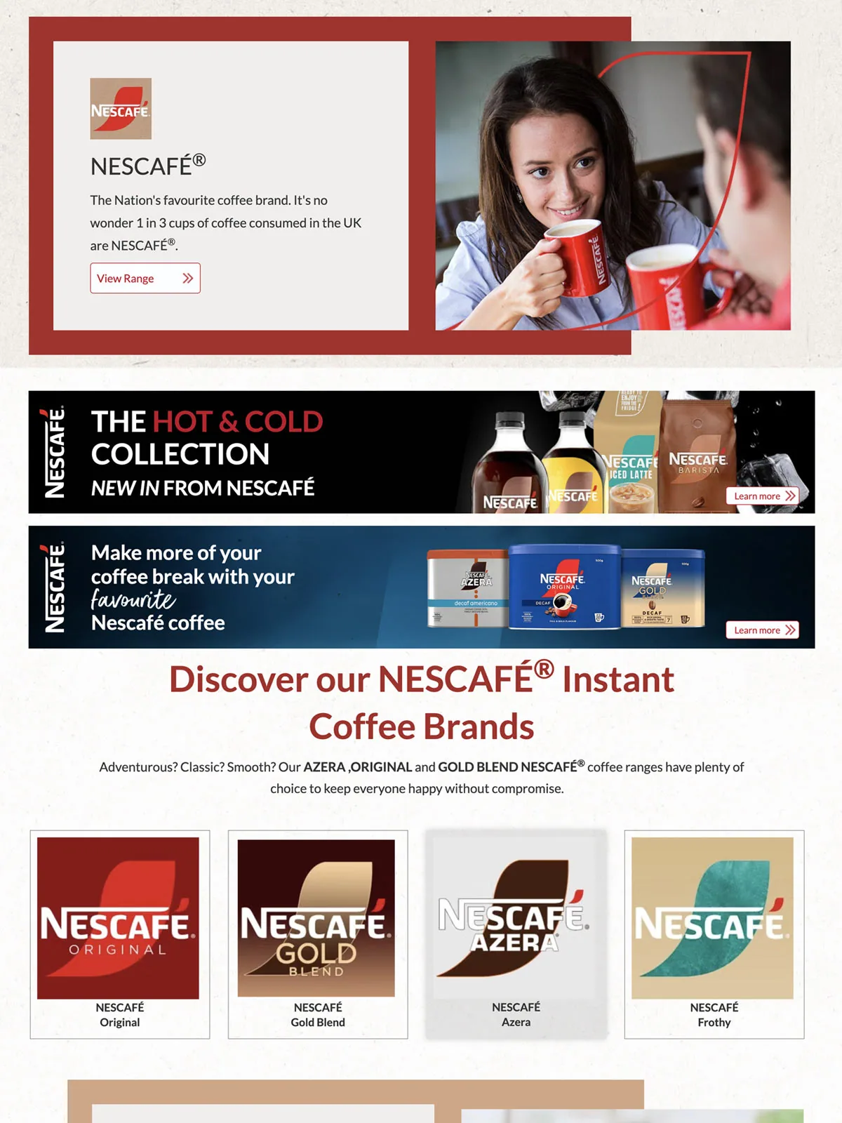
This promotion brings banners, a landing-page design and an email together. It shows another part of the work: carrying a product offer across a sequence of digital formats.
Nescafé brand and product assets belong to the supplier. Shown here as Langstane campaign layouts.
Banner, landing-page and email design for Langstane, adapting the supplier’s brand and product assets into a connected set of digital campaign formats.
Outcome
Connected wherever
it appeared.
Each promotion worked as one connected campaign rather than a collection of unrelated pieces. Supplier artwork, original creative and product information could be adapted across print, banners, landing pages and email while remaining recognisable and appropriate for each format.
Across the work
Recognisably related.
Made for the format.
Whether I’m adapting a supplier’s creative or designing a themed promotion from scratch, the aim is the same: make the offer clear and keep the campaign connected across its different uses.
Let’s talk about your project ↗